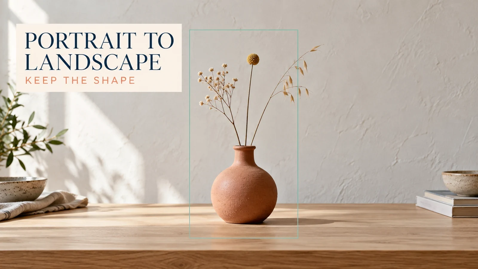
You have a good vertical product photo, but the website needs a wide banner. Set the destination canvas first, keep the original photograph's proportions locked, and use AI to generate the missing background. Pulling the image sideways only makes the product wider; it does not create more of the scene.
For this composition exercise, a small terracotta vase stays the same shape while the surrounding wall and tabletop gain room. The illustrations describe layout choices and inspection points, not a measured comparison between image extenders. The useful result is an image in landscape orientation with the original subject still recognizable.
Decide Where the Extra Space Must Go
Before opening an image stretcher, identify the final placement. A website banner with a headline on the left needs a different composition from a centered video thumbnail or a two-column editorial image.
Write down the target ratio, required product visibility, and intended text area. For a 16:9 image, confirm that the entire vase and stems still fit when the photo is positioned on the wider canvas. Avoid deciding the headline area only after generating the scenery.
Intended use | Place the product | Expand mainly toward |
|---|---|---|
Banner with left-side copy | Right of center | The left side |
Centered editorial cover | Near the visual center | Both sides, in controlled increments |
Product plus a callout | Away from the callout | The open copy area |
The decision changes how much new content the model must invent. A restrained extension of a plain wall is easier to inspect than a wide scene full of furniture, windows, and reflections. My preference for a small shop banner is enough room for the message, with as little invented scenery as the brief allows.
Calculate the Canvas Without Altering the Product
Suppose a portrait source is 1,200 pixels wide and 1,800 pixels high. Keeping its full height in a 16:9 canvas gives a target width of 1,800 × 16 ÷ 9 = 3,200 pixels. That means adding 2,000 pixels across the sides; it does not mean stretching the existing 1,200 pixels to 3,200.
This is a layout example, not a recommended upload size for every tool. If the destination needs only 1,600 × 900, you can work at a suitable size while maintaining proportions and checking that the product remains large enough. Avoid upscaling simply to make the project dimensions sound impressive.
Separate canvas dimensions from the subject's pixel dimensions. If the vase occupies the same number of pixels before and after expansion, adding empty wall does not make its label sharper. A larger file can still contain the same small product. Judge the product at its final displayed size before deciding whether this source is adequate.
If most of that large new area would be empty wall, consider a smaller composition change. A modest crop at the top or bottom can reduce the extension needed, provided it does not remove stems, packaging, or other required details.
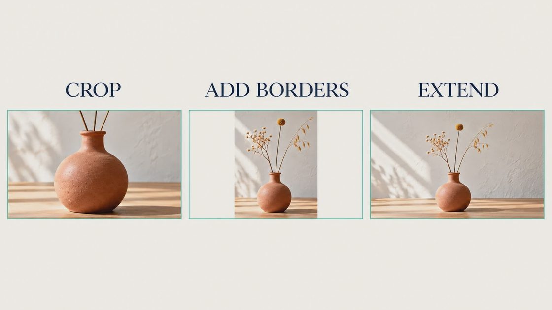
An AI image extender adds content beyond the frame. A stretch-image command may instead resample existing pixels. Check the feature description and preview: the vase's width-to-height relationship should remain stable while the canvas grows.
Choose Cropping, Borders, or AI Outpainting Deliberately
AI outpainting is useful when the scene must continue naturally. It is not mandatory just because the original is vertical.
Crop: Useful when the full important subject still fits and you can lose some height.
Add borders: Useful when preserving every photographed pixel matters more than seamless scenery.
Extend the background with AI: Useful when the layout needs a continuous wall, floor, or tabletop.
For a simple social graphic, a designed border may look intentional and require less repair. For a natural-looking product scene, the AI route can fit better. Choose the method based on the publication, rather than treating generated background as automatically superior.
Keep a trustworthy copy of the source in the project. If your editor regenerates the central object during expansion, the preserved original gives you something to compare or composite back in. Instructions to keep the subject unchanged are helpful, but they are not proof that it stayed identical.
Expand a Controlled Area First
Adobe's Camera Raw Generative Expand guide describes enabling Expand, dragging the canvas boundary outward, generating variations, and keeping a preferred result. Availability and preview settings depend on your installation, so use the controls shown in your version.
Start with one edge or a modest expansion rather than an ambitious four-sided rebuild. For the vase, continue the off-white wall and pale tabletop before asking for anything decorative. The original lighting and table angle should guide the new area.
If your tool accepts a prompt for the extension, use a compact scene continuation brief:
Continue the existing off-white plaster wall and pale oak tabletop into the added space. Match the current window light and table perspective. Keep the vase, stems, original framing scale, and existing photographed details unchanged. Leave the expanded area uncluttered.
Do not request a new camera angle while solving portrait-to-landscape AI conversion. A different viewpoint asks the model to reveal unseen sides of the product, which is a separate and harder task to verify.
Follow the Lines Across the Old Frame
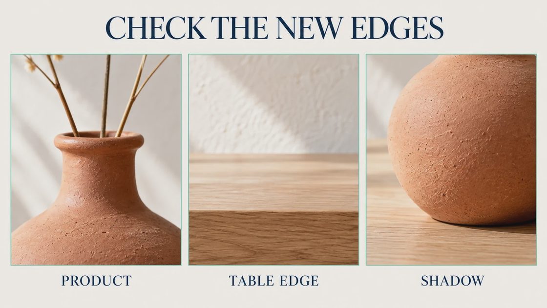
After generation, inspect where the original image meets the new content. The former boundary should not become a change in grain, light, or geometry.
Start with any straight line. A tabletop edge should continue at the same angle; a wall joint should not jump or bend. Then inspect light transitions, repeated wood patterns, and the object's contact shadow.
Visible problem | What it means for the composition | Revision to try |
|---|---|---|
Table edge bends | The extension breaks perspective | Generate a smaller area and simplify the scene brief |
Vase becomes wider | Original subject changed or was stretched | Return to the original and lock its proportions |
Stems multiply | The model invented subject content | Reduce the area involving the subject; reject duplicate stems |
Bright strip at the join | New lighting does not match | Compare another variation before changing overall exposure |
New props crowd the headline | Expansion ignores the layout purpose | Specify an empty copy area and remove prop requests |
Do not hide a broken table edge with a headline before approving the background. Copy can conceal a defect in one layout and expose it again when the design is resized.
Keep the Source Area Under Review
Inspect the original center as carefully as the generated sides. Adobe notes that some adjustments can affect how the original area appears during expansion, so “the new part looks good” is not a complete acceptance check.
Compare the vase's silhouette, stem count, rim, and contact shadow at the same display size. If the object has shifted or changed finish, decide whether you can retain the original foreground. If not, the result may suit an internal concept but not an accurate product image.
To expand an image to 16:9 with AI, keep the format requirement separate from the amount of scene invention. You can meet the ratio with a small subject, but that does not mean the banner communicates the product well. Review the actual layout with the planned text rather than approving ratio alone.
Export the Placement You Designed
Keep the layered or editable project, and export a separate file for the website or social placement. Open the downloaded file and confirm dimensions, subject proportions, and the seam between original and generated areas.
Check the mobile crop too. A wide image may be cropped differently by a page template; the vase and headline should not compete for the same central safe area. This is a placement check, not a reason to invent a second scene unnecessarily.
Before the next generation, draw the product's required space and the headline's required space on a simple layout. If those two areas already overlap, fix the composition before asking AI for more background.
Keep any alternate crop as a separate export rather than overwriting the expanded master. That gives you a reliable way to revise the mobile layout without asking the model to recreate the same wall and tabletop again. Reusing approved scenery also makes later differences easier to spot.